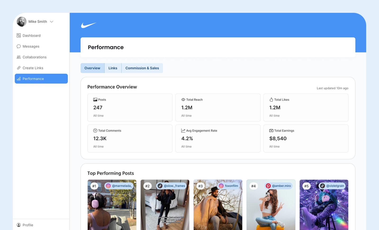
Overview
Creators land on the Overview page and immediately understand
how they are doing. Compact tiles show posts, engagement rates,
reach, and total earnings for the selected period. The Top
Performing Posts strip highlights five posts with quick stats,
while two summary blocks guide deeper exploration into link and
sales performance.
Key decisions
-
Five top posts, not ten.
Enough signal to spot patterns, few enough that creators can
scan without scrolling. Longer lists tested worse because
creators skimmed and stopped pulling insights.
-
Led with engagement rate over raw likes.
Interviews showed creators use rate, not volume, when
pitching brands. The Overview should match how they actually
talk about their work.
-
Global time range, not per-tab.
Context persists across the whole section so creators don't
re-select "last 30 days" four times in one session.
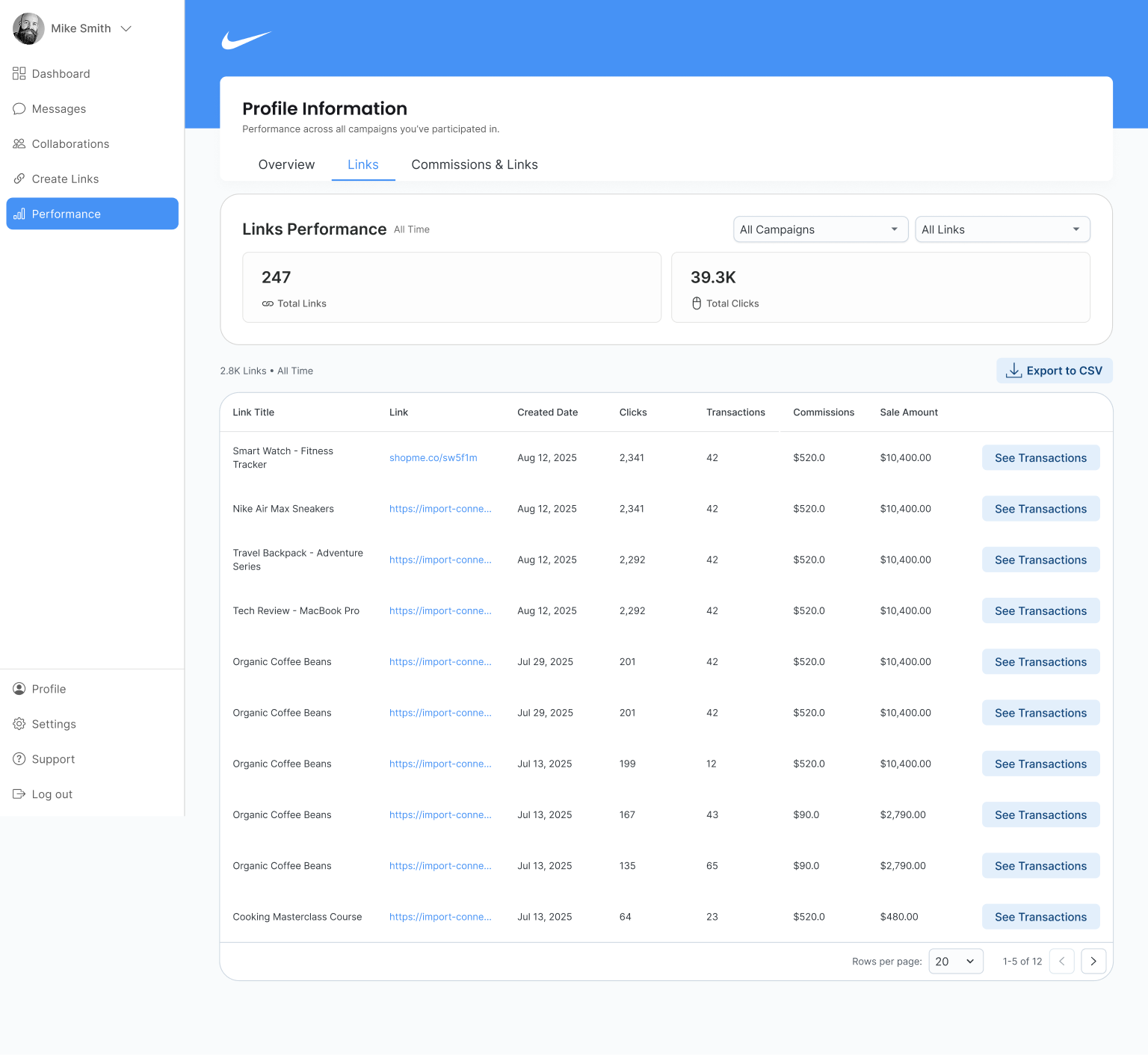
Links
The Links tab lets creators filter affiliate links by date,
clicks, transactions, commissions, and sale amount. Top-level
counters show Total Links and Total Clicks with filters for
campaign and link type, and CSV exports respect current table
filters. On mobile, the same model shifts into stacked cards for
legibility.
Key decisions
-
Sortable table over card grid.
Links are a comparison task. Creators want to rank by clicks
or commission, which tables do natively. Cards forced
scrolling without making comparison easier.
-
CSV exports respect current filters.
Creators were previously exporting everything and filtering
in spreadsheets. Mirroring on-screen state cuts a full step
out of brand reporting.
-
Full URL on hover, truncated by default.
Link strings are long and noisy. Truncation keeps rows
scannable without hiding data creators occasionally need.
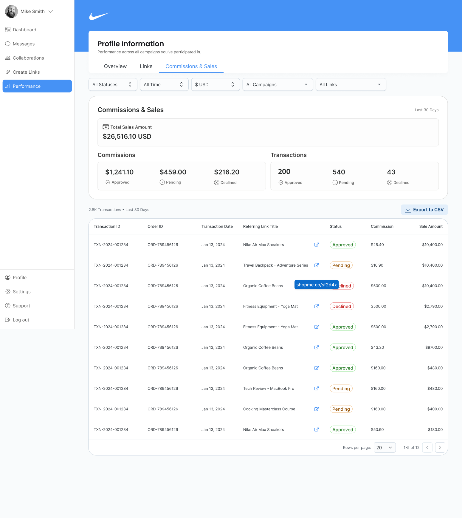
Commissions & Sales
The third tab answers the three questions creator support hears
most often:
What got approved? What is pending? What was declined?
A summary band shows Total Sales for the selected period, then
three cards break down commissions by state. The table lists
transactions with status chips, order IDs, referring links, and
amounts, and exports match what is on screen.
Key decisions
-
Three status cards before the table.
Most creators open this tab to answer one of three
questions: approved, pending, or declined. Surfacing counts
up top means they often don't need to open the table at all.
-
Status chips use consistent color language across the
platform.
Green, yellow, and red carry meaning elsewhere in CreatorIQ.
Reusing them removes a learning step for creators moving
between sections.
-
One-click from transaction to originating link.
Creators asking "what got approved" almost always follow
with "from which link." The jump removes the context-switch.
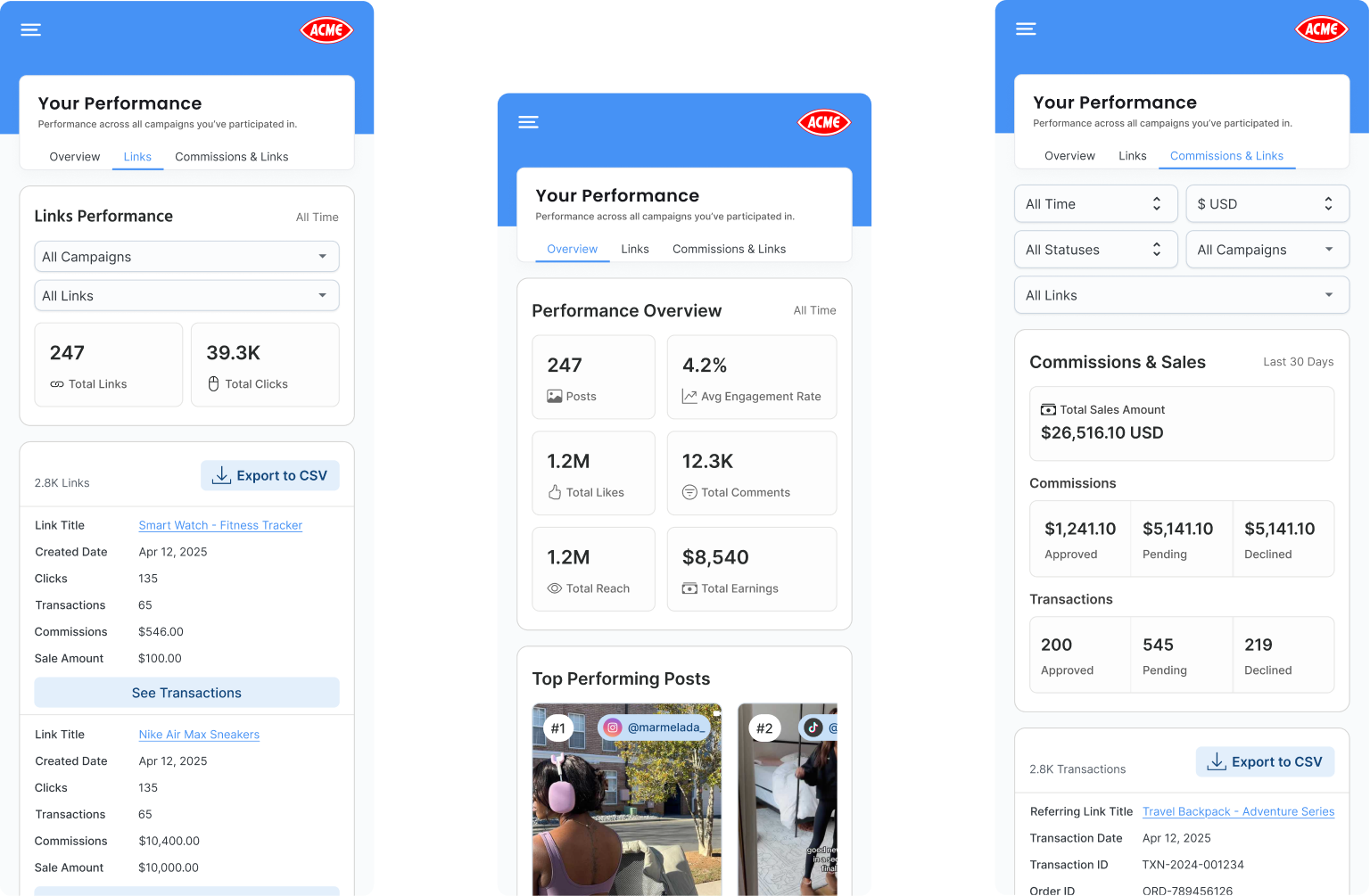
Mobile
Key decisions
-
Same mental model, stacked layout.
All three tabs keep their structure. Overview tiles stack,
Links become cards, Commissions chips move above the table.
No one has to relearn the section on mobile.
-
Sticky filters, not a drawer.
Creators filter constantly on mobile and drawer patterns
hide state. Sticky chips keep active filters visible without
a tap.
-
Exports work from phone.
Creators often pull reports between meetings or on the go.
Requiring desktop to export was a common support complaint.