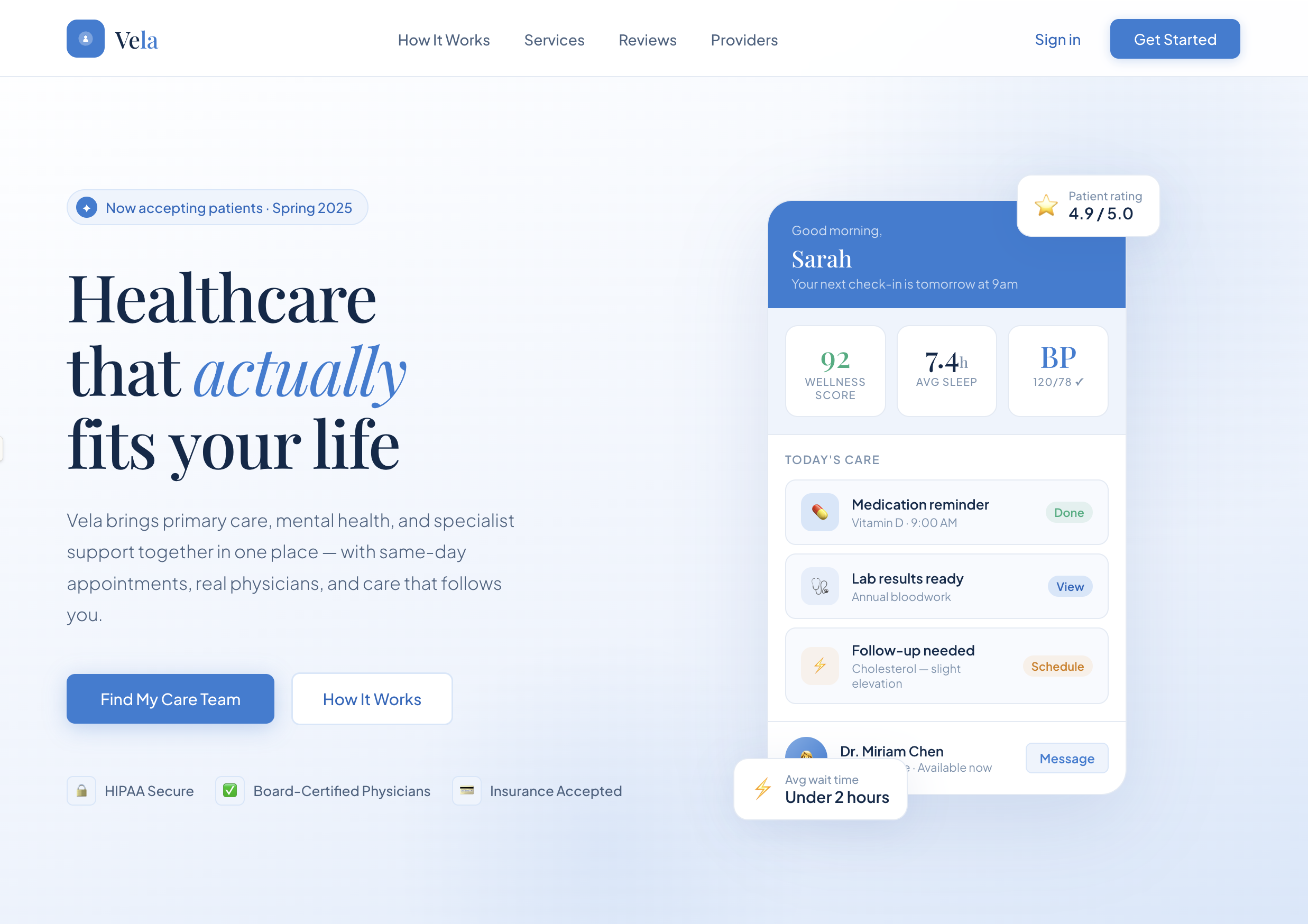
Concept
The goal was to move healthcare away from cold utility and toward a more reassuring editorial experience with stronger trust cues.
Case study
A healthcare landing and onboarding concept built to feel calm, premium, and easy to trust.
Concept
The goal was to move healthcare away from cold utility and toward a more reassuring editorial experience with stronger trust cues.
System
The visual language uses softer blues, serif-led hierarchy, and clearer conversion moments so the product feels guided instead of clinical.
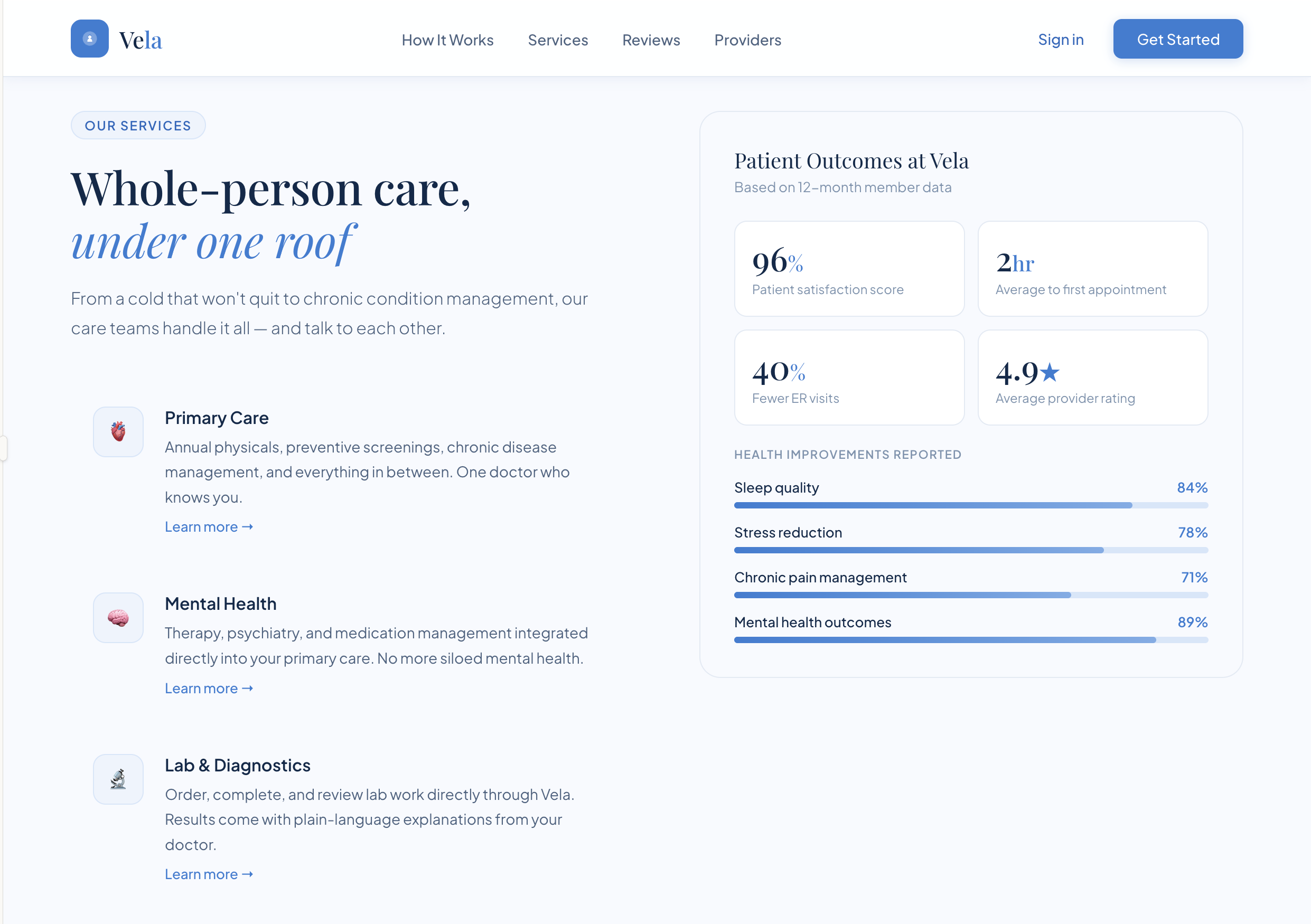
Services and outcomes
Service education and proof points sit together to make the value of the product feel more concrete and credible.
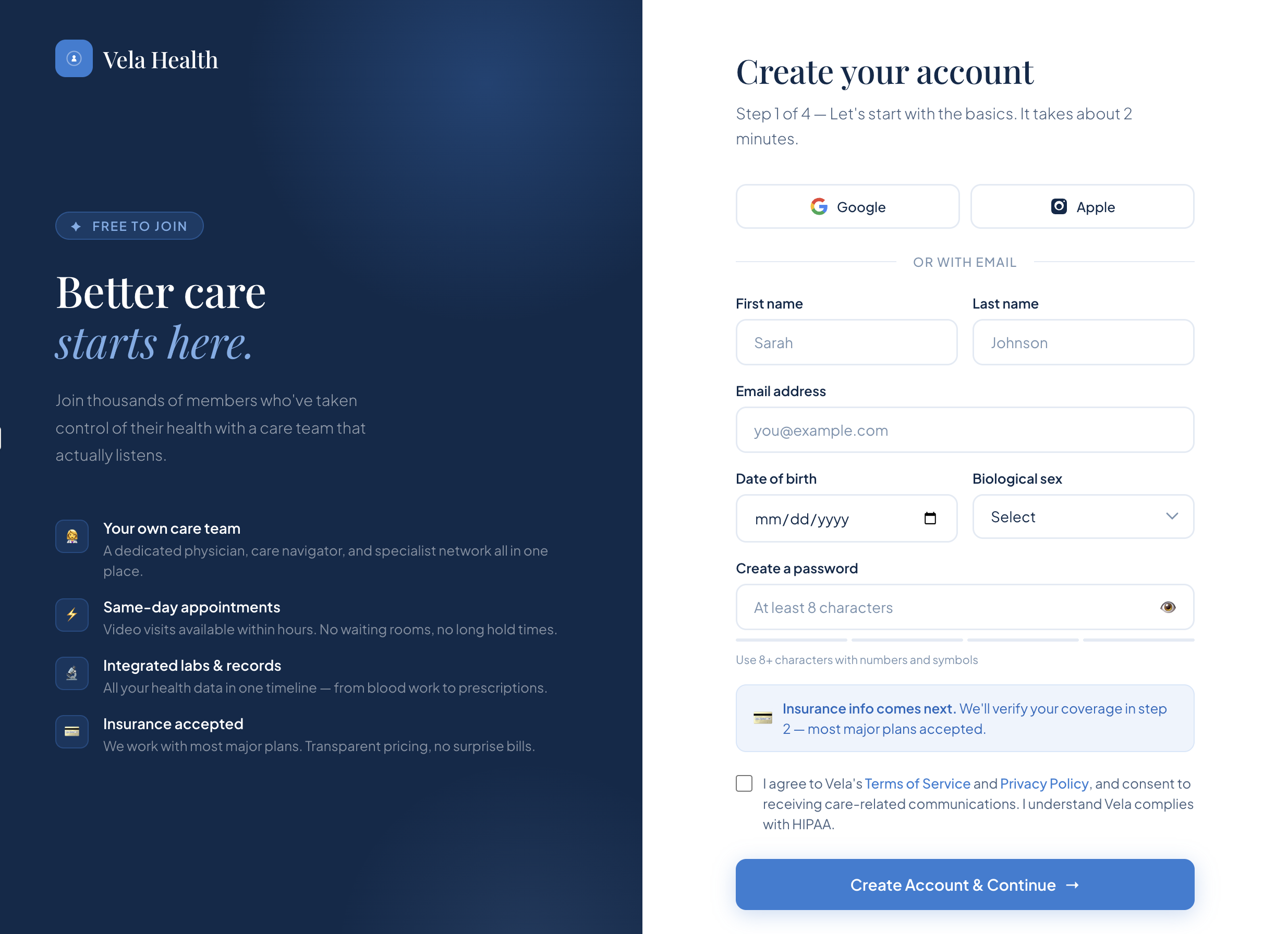
Account creation
Sign-up is structured into clear steps, with form fields, insurance context, and reassurance handled in a cleaner way.
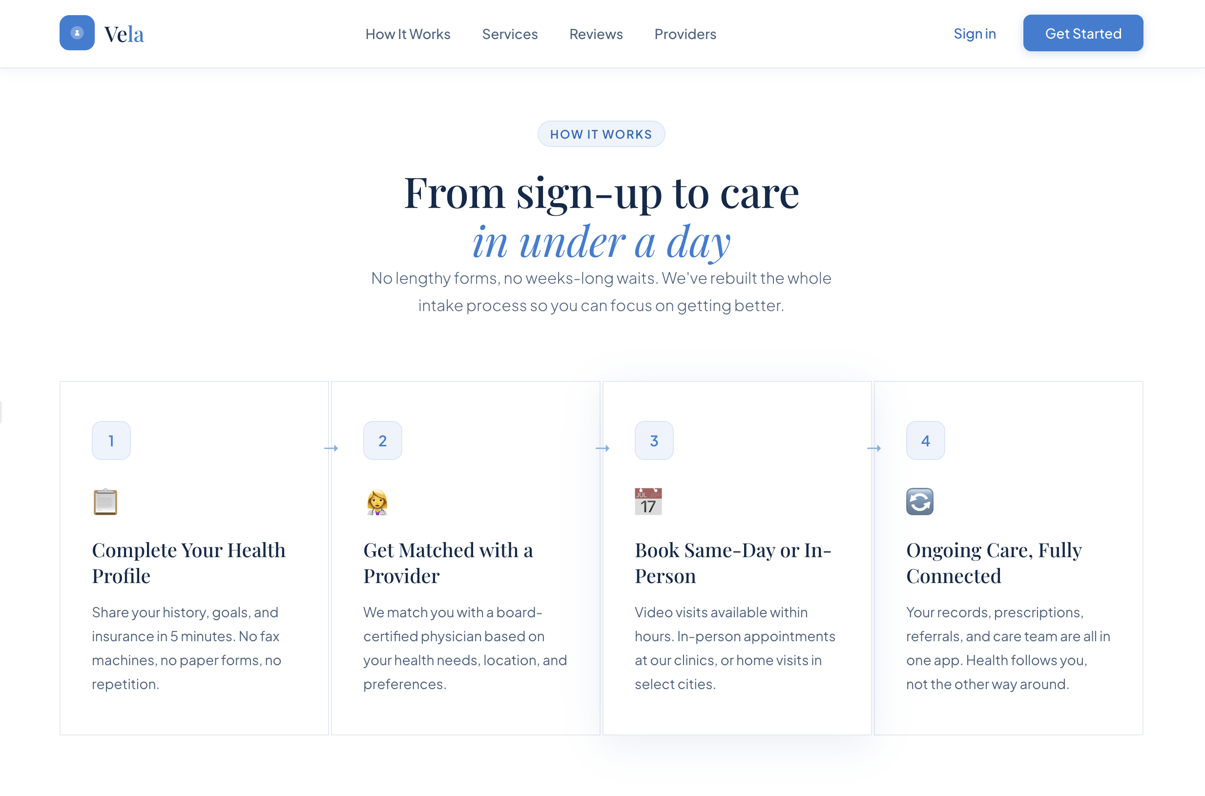
How it works
A four-step onboarding story makes the service feel guided and easy to understand at a glance.
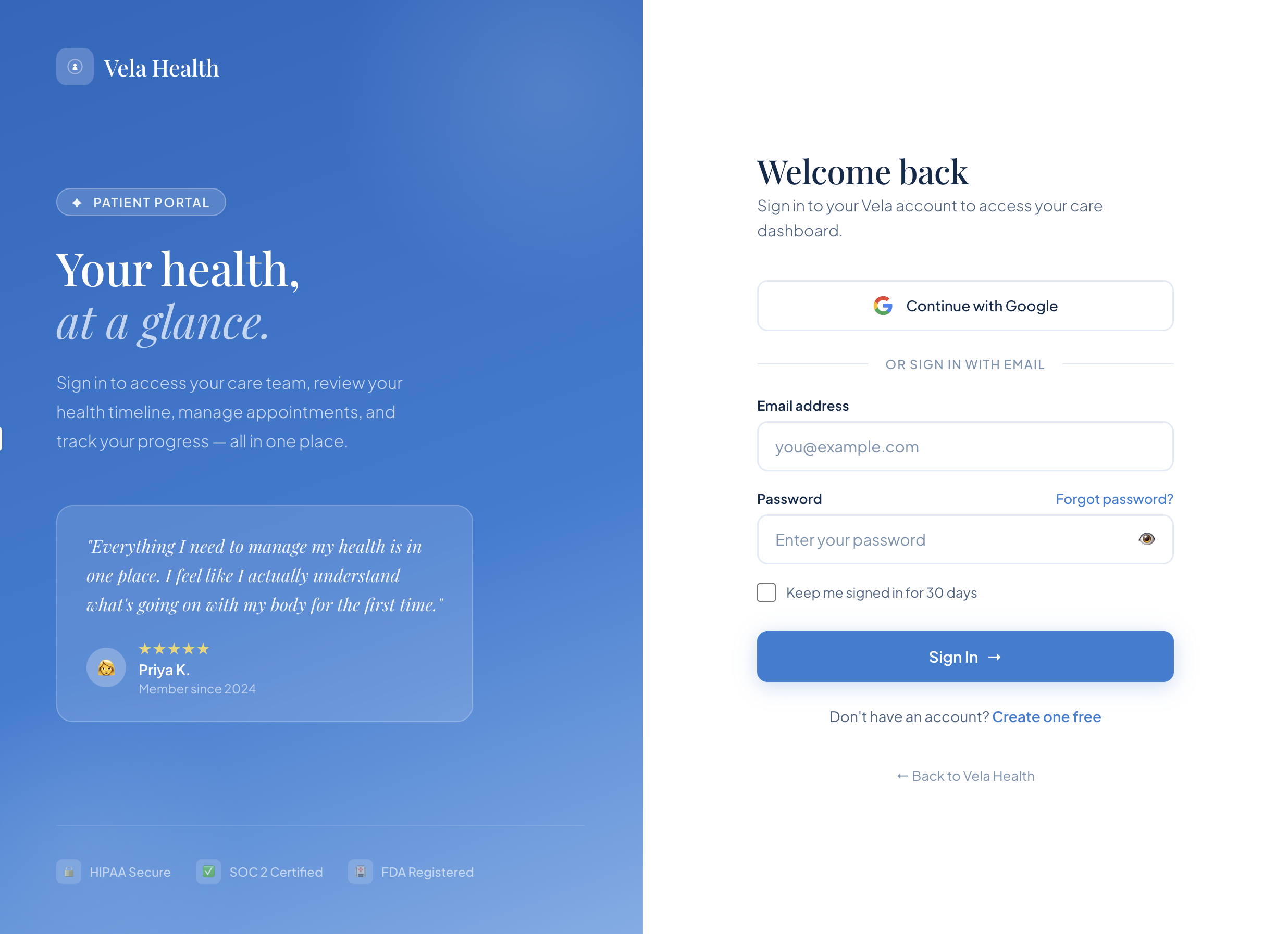
Patient portal sign in
The returning-user flow keeps the same calm visual language while making portal access feel straightforward and secure.
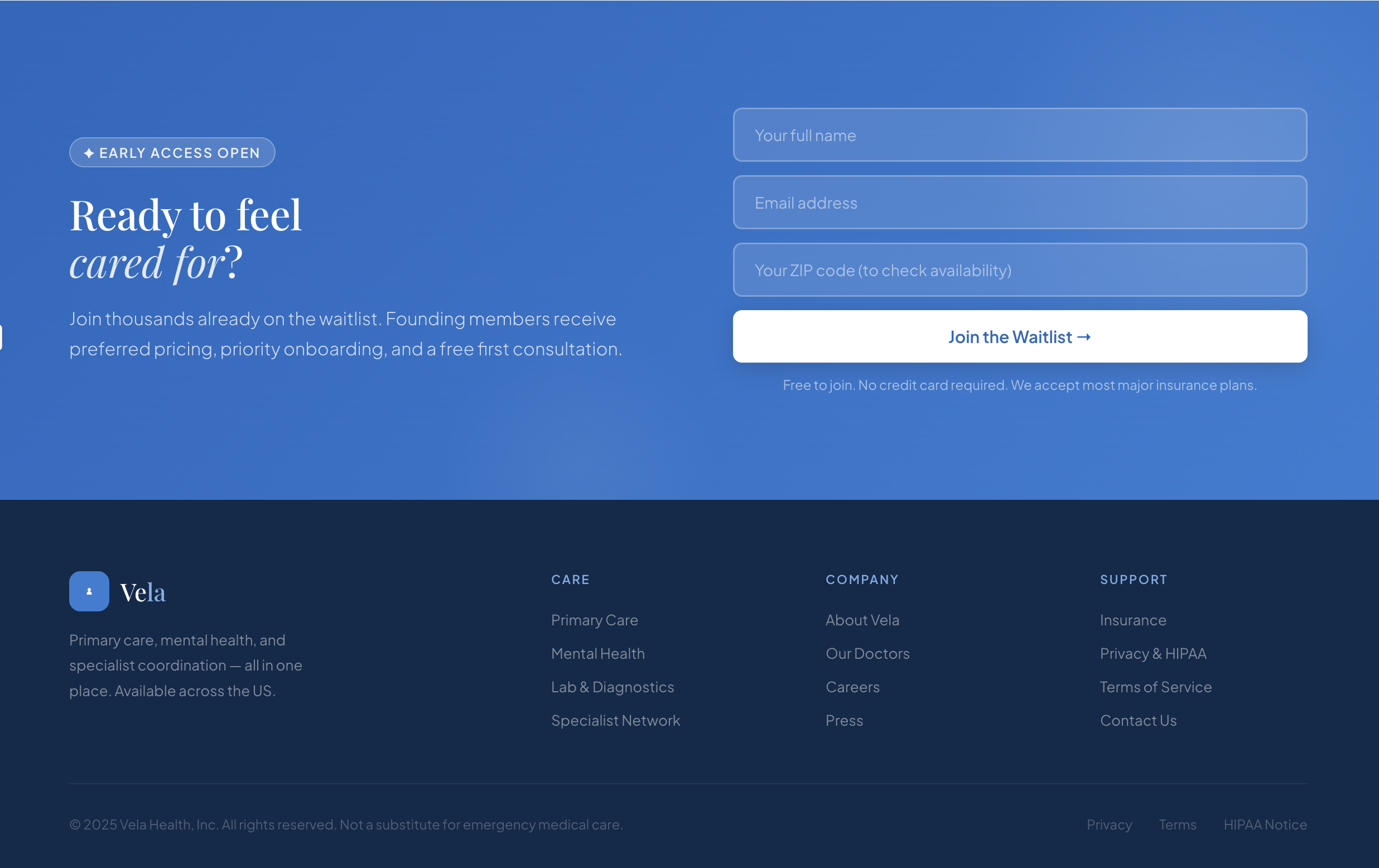
Final conversion
The lower page stays clean through the waitlist form and footer, keeping the final conversion step simple and premium.
Outcome
The result is a more cohesive healthcare concept: a landing page with stronger visual trust and an onboarding flow that feels lighter from the first interaction.