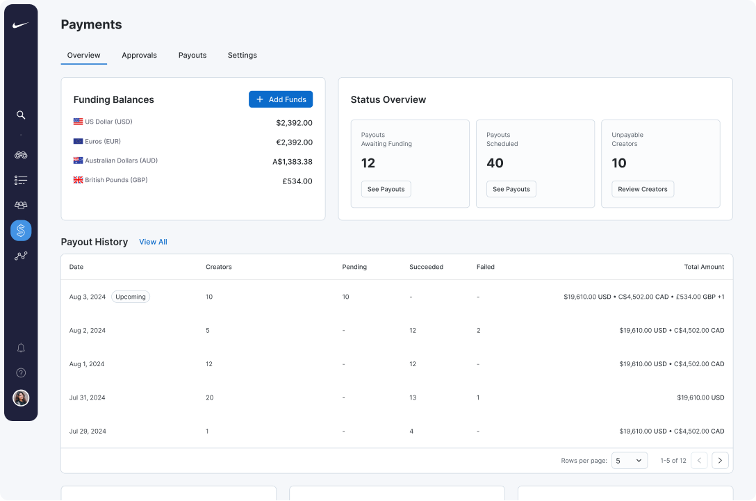
Overview
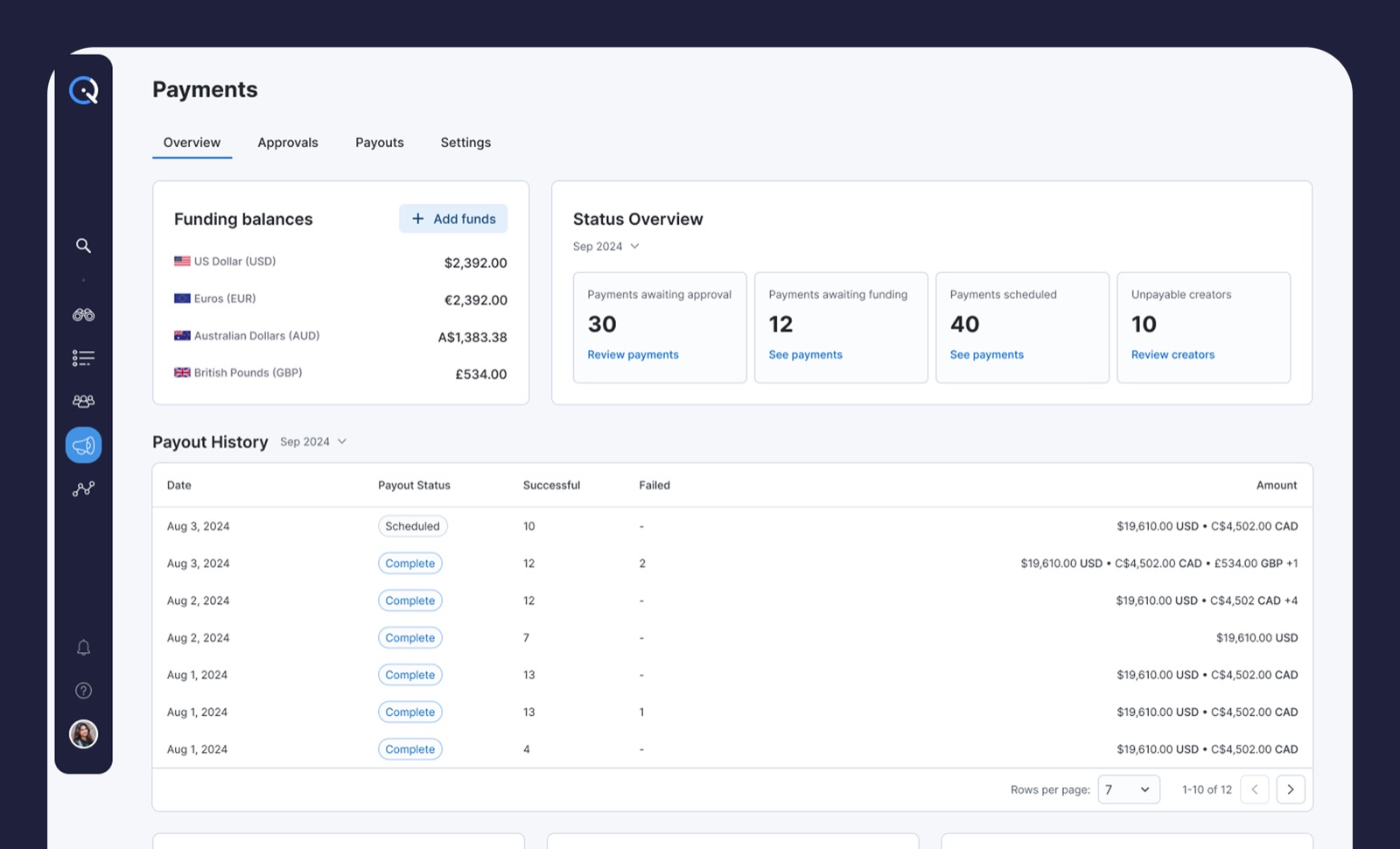
Managers land on Overview and see the full financial picture
in one screen. Currency balances sit at the top so planning
starts with reality. Status tiles surface Awaiting Funding,
Scheduled Payouts, and Unpayable Creators, and each tile opens
the exact filtered list underneath. Recent Payout History
mirrors the columns used elsewhere, so drilling down feels
consistent.
Key decisions
-
Separate wallets per currency instead of a single
converted total.
Managers plan against actual available funds, not
approximations.
-
Status tiles as doorways, not dead ends.
Every number links to the filtered list behind it, so
spotting an issue and acting on it is one click.
-
Add Funds button on the Overview itself.
Funding is the most common task after spotting a gap, and
hiding it in Settings created unnecessary navigation.
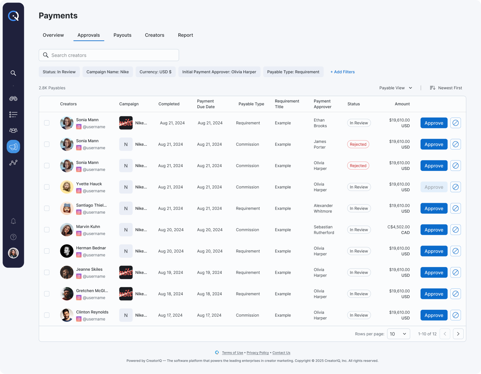
Approvals
Approvals is a focused list designed for speed and
accountability. Items are grouped by what managers care
about: campaign, method, and currency, with bulk approvals
and rejections and inline explanations that write to an audit
trail. Smart filters make clearing today's queue a five-minute
task instead of a wild goose chase.
Key decisions
-
Grouping by campaign, method, and currency.
Managers think in these three dimensions when clearing
queues. Grouping by date or amount tested worse because it
did not match how they batch their work.
-
Bulk actions with inline explanations.
Approvals without an audit trail were a compliance risk.
Requiring a separate explanation screen slowed the flow.
Inline comments balance both.
-
Smart filters that remember state.
Queue clearing is a repeated daily task. Filter state
persistence cuts setup time on every return visit.
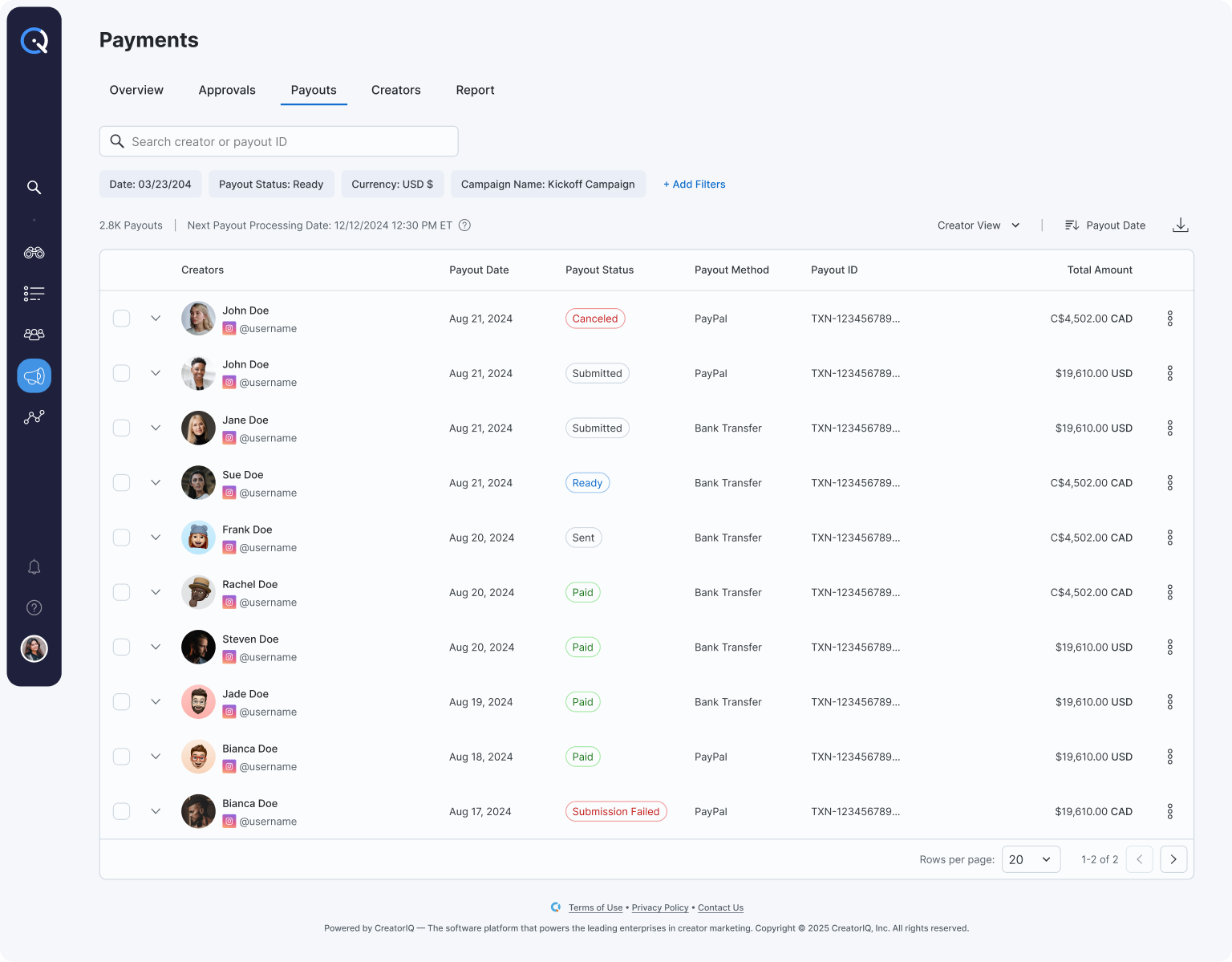
Payouts
Payouts unifies Pending, Sent, and Failed payments into a
single view. Solutions live next to problems, and filters let
finance work a specific rail or currency without distraction.
Status language is consistent across the platform, so nobody
has to relearn terms between pages.
Key decisions
-
Unified Pending, Sent, and Failed in one view.
Splitting these across tabs hid the most important signal:
what is broken right now. A single table with status chips
surfaces issues without tab-hopping.
-
Actions next to issues.
Resend, cancel, and open receipt all live on the row
itself. Previously these required opening a detail page,
which added friction for a task that should be one click.
-
Consistent status language across the platform.
Terms like "Pending" meant different things in different
sections. Standardizing removed a learning step between
pages.
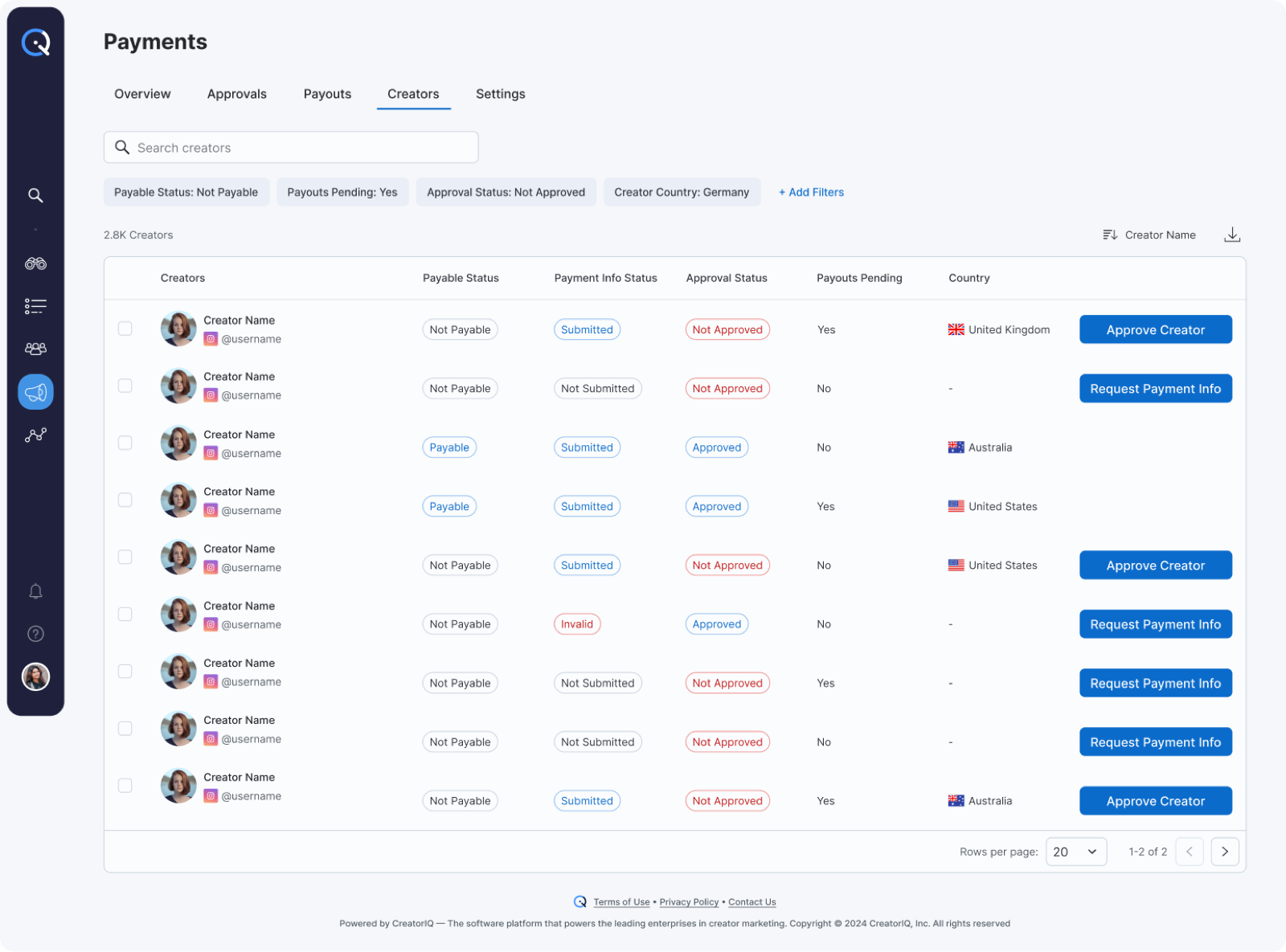
Creators
Creators gives managers a focused view of payable and
payment-ready creators across campaigns, so they can spot
missing information and unblock payouts without opening a
profile.
Key decisions
-
Payable status surfaced first.
Managers audit Creators to unblock payouts. Leading with
payable/not-payable status answers the first question in
one glance.
-
Grouped by blocker, not by name.
Creators with missing info cluster at the top so the most
actionable rows get attention first.
-
Request Payment Info inline.
The most common next step — nudging a creator for missing
details — lives on the row itself instead of inside a
creator profile.